- Internal Signage
- Outdoor Signage
-
-
- Outdoor Signage Products:
- Neon Signs
- LED Signage
- Fabricated Letters
- Exterior Wayfinding
- Monoliths & Totems
- Nameplates
- Solar Signage
- Projecting Signs
- Fascia & Shop Signage
- Site Boards
- ASIAD Compliant
- Stacker Signs
- V-Boards
- Flat Panel & Post
- Tray Panel & Post
- Road Traffic Signs
- Retail Park Signage
- Composite Cladding
- Projecting Banner
- Canopies & Awnings
- Bespoke Aluminium Extrusions
- Heritage Signage
- Interpretation Panels
- Outdoor Signage Products:
-
-
- Letter Styles
-
-
- Letter Styles Variations:
- Flat Cut Acrylic
- Flat Cut Metal
- Flat Cut Aluminium Composite
- Built Up Rim & Return
- Halo Illuminated
- Face Illuminated
- Face/Halo Illuminated
- Built Up Non Illuminated Acrylic
- Metal 3D Lettering
- Mesh Illuminated
- Vinyl Lettering
- LED Acrylic Faux Neon
- Open Trough + LED Bulbs
- Open Trough + LED Faux Neon
- Open Trough + Traditional Neon
- Trough Letters + Live Moss
- Letter Styles Variations:
-
-

Manchester T2 Transformation Project
Passengers using any modern airport will appreciate good design and modern facilities. But what makes any great building? The users must understand the building, they must feel at ease as they are processed and move through the spaces.
UP, UP AND AWAY
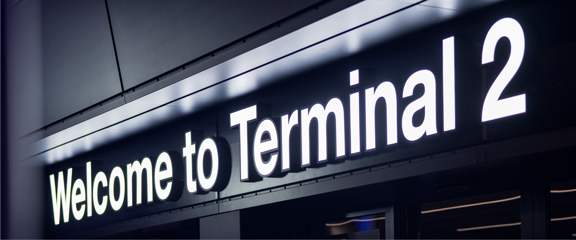
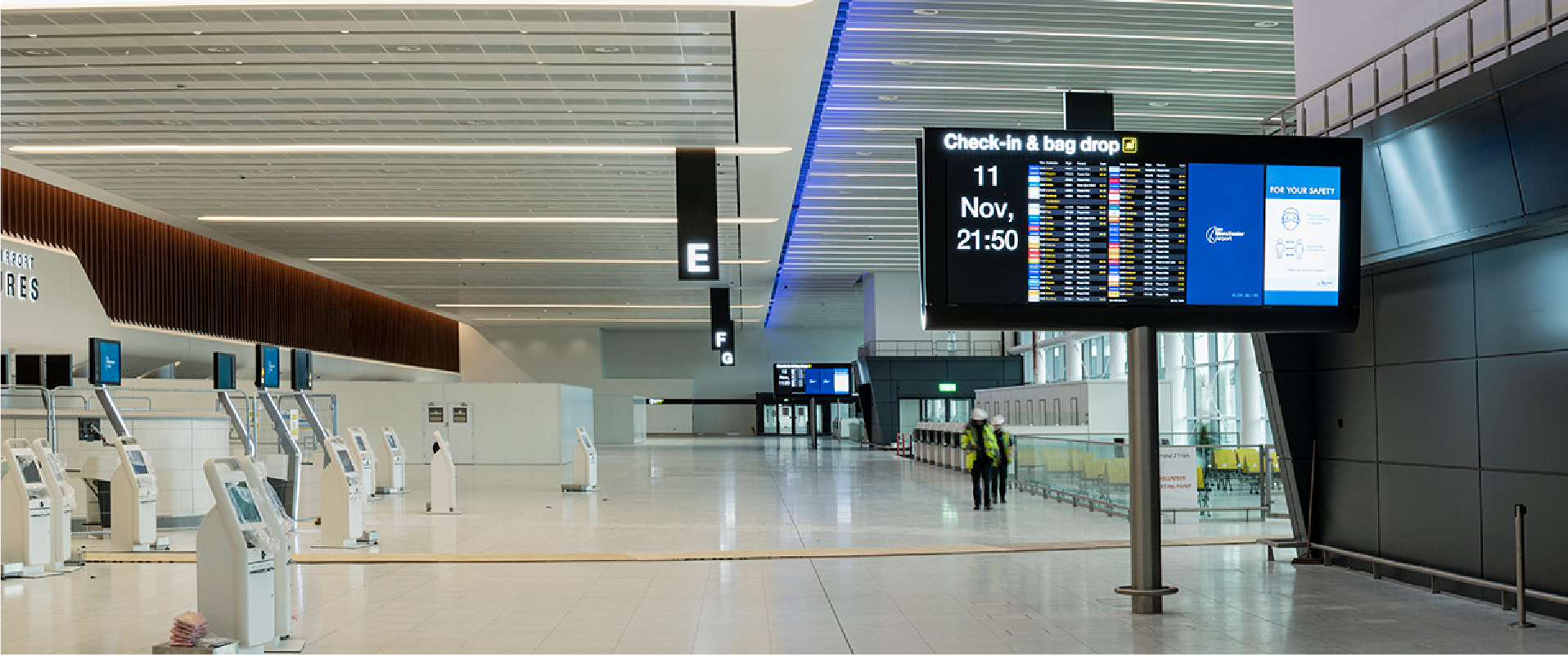
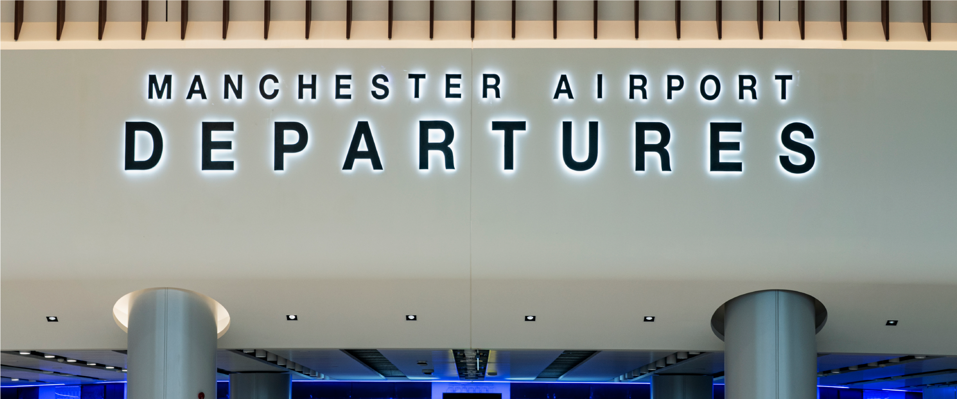
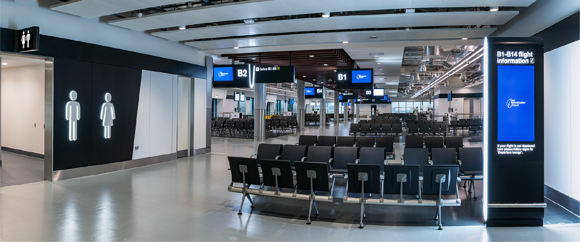
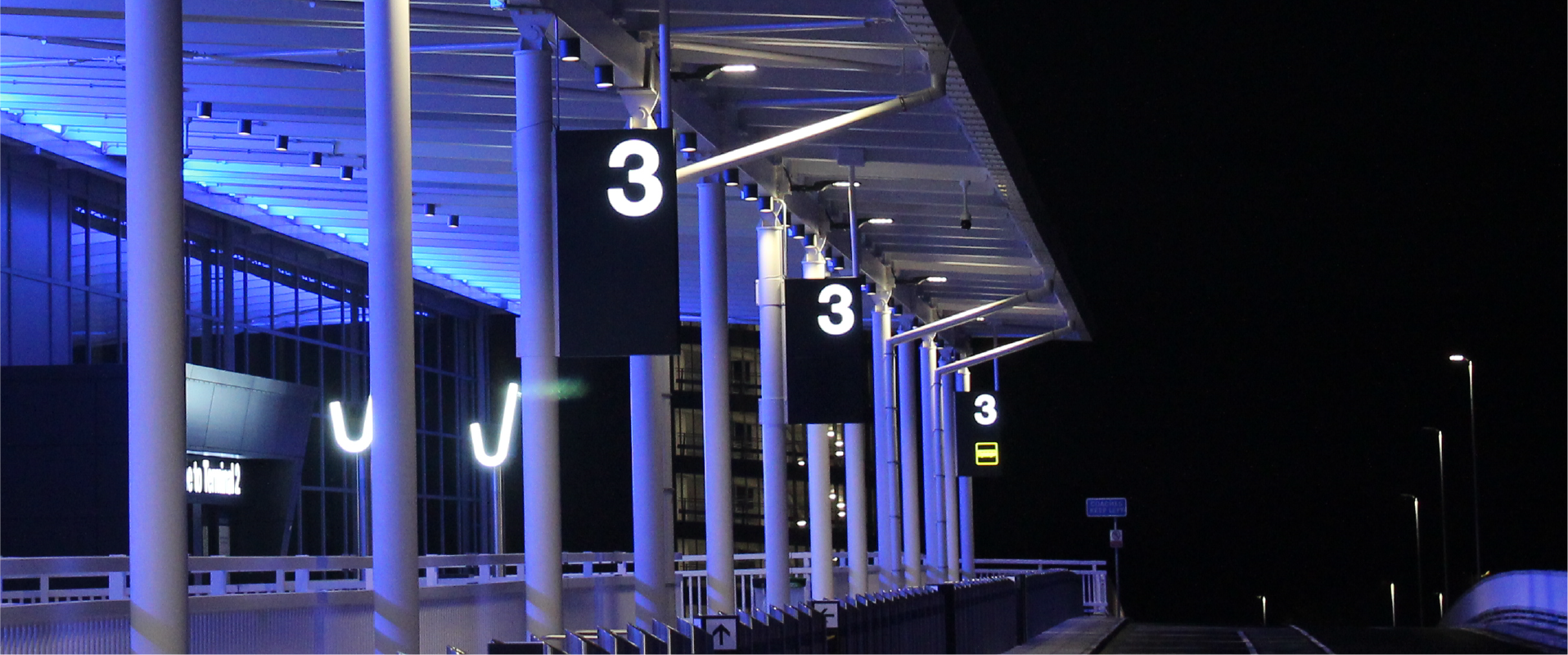
Astra Signs have recently completed the wayfinding signage as part of Manchester airports major investment of more than £1bn to give the North the world class international gateway. Following a successful tender process astra signs were appointed to design manufacture and install the wayfinding to conform to stringent standard set out by the department of transport and had be ASIAD compliant. (Aviation security in airport design).
Astra Signs worked closely with the main contractor Laing O’rourke and the architects and wayfinding consultants Pascal Watson to develop digital and traditional wayfinding signs. As the design has a very neutral palate and the spaces are open and inviting.
The products were designed to stand out like pieces of sculpture within the space.
TESTIMONIAL
Passengers using any modern airport will appreciate good design and modern facilities. But what makes any great building? The users must understand the building, they must feel at ease as they are processed and move through the spaces, they need to know which gate to get to and how long it will take.
That is why good wayfinding is so important. Large airport buildings are complex, and passengers can become easily overwhelmed and confused. The architecture and building fabric must be designed to have natural wayfinding. Where way finding products are incorporated, they need to be part of a family of products and they need to be integral to the overall design concept. This can be a real challenge as when it is done well it is taken for granted, and no one notices because the signage integrates with the overall ambiance. That is what we have achieved at Manchester.
For Manchester Airports transformation project, the design has a very neutral palate and the spaces are open and inviting. The products were designed to stand out like pieces of sculpture within the space. The products and signage developed and manufactured by Astra Signage have really hit the mark and have exceeded all expectations.
Astra have designed and installed the signage for the site approach, the forecourt and the new eight story Area West car park. They also designed and installed the signage for the Terminal 2 extension and the new piers, Pier 1 and Pier 2 phase 1. The FID products were designed as sculptural planar forms, clad in black metal with bold led illuminated edges. Astra understood the architect product design intent from the start. They also understood that the smaller Fid products in the pier had to have a direct relationship to the larger Fid products in the terminal. This created unique project technical challenges that Astra overcame.
Astra worked very closely with LOR and the architects to ensure proportions and the level of detail achieved as well as the quality of finish provided was superb. Each design challenge was approached with the same enthusiasm, until the technical issues were resolved and the right solutions achieved.
It was a real pleasure to work with Dave and his professional team. We will be recommending them for Airport and other signage projects in the future. We would recommend then for any signage project.
Tony Ward
Technical Director Pascall and Watson Architects.