- Internal Signage
- Outdoor Signage
-
-
- Outdoor Signage Products:
- Neon Signs
- LED Signage
- Fabricated Letters
- Exterior Wayfinding
- Monoliths & Totems
- Nameplates
- Solar Signage
- Projecting Signs
- Fascia & Shop Signage
- Site Boards
- ASIAD Compliant
- Stacker Signs
- V-Boards
- Flat Panel & Post
- Tray Panel & Post
- Road Traffic Signs
- Retail Park Signage
- Composite Cladding
- Projecting Banner
- Canopies & Awnings
- Bespoke Aluminium Extrusions
- Heritage Signage
- Interpretation Panels
- Outdoor Signage Products:
-
-
- Letter Styles
-
-
- Letter Styles Variations:
- Flat Cut Acrylic
- Flat Cut Metal
- Flat Cut Aluminium Composite
- Built Up Rim & Return
- Halo Illuminated
- Face Illuminated
- Face/Halo Illuminated
- Built Up Non Illuminated Acrylic
- Metal 3D Lettering
- Mesh Illuminated
- Vinyl Lettering
- LED Acrylic Faux Neon
- Open Trough + LED Bulbs
- Open Trough + LED Faux Neon
- Open Trough + Traditional Neon
- Trough Letters + Live Moss
- Letter Styles Variations:
-
-

Understanding Wayfinding Signage: A Guide to Navigating Spaces
Wayfinding is about more than just signs- it's about creating intuitive pathways that guide people through spaces with ease. Explore the importance of wayfinding signs in improving navigation, safety, and accessibility.
The Art of Wayfinding: Enhancing Navigation and User Experience
What is Wayfinding?
Wayfinding encompasses the process of navigating and orienting in a physical space. It includes the strategies, tools, and systems that help people find their way in buildings, urban environments, or natural settings. Wayfinding often involves a combination of signage, maps, symbols, colours, and spatial design elements that guide people from one location to another. By delving into the concept of wayfinding signs, we can explore their importance, design, principles, types, applications, and how they contribute to overall space usability.
Importance of Wayfinding Signs:
-
Navigation and Efficiency: They help people reach their destinations quickly and efficiently, reducing confusion and stress.
-
Accessibility: Well-designed wayfinding systems enhance accessibility for everyone, including people with disabilities- for example, tactile signs for the visually impaired, clear and easy to read fonts, and well placed signage.
-
Safety: In emergencies, clear wayfinding signs are crucial for guiding people to exits, emergency shelters, or first aid stations.
-
Branding and Aesthetics: They can also reflect the branding and aesthetics of a space. In commercial environments, signs are often designed to match the brand’s identity, reinforcing the brand and enhancing the overall user experience.
Creating effective wayfinding signage involves understanding the psychology of navigation and the needs of the users.
Key principles include:
-
Clarity and Simplicity: The primary purpose of wayfinding signs is to communicate information quickly and clearly. This means using simple language, easy to read fonts, and universally recognised symbols or icons.
-
Consistency: Signs should be consistent in their design, including font styles. Colours, and placement throughout a space. Consistency helps users feel more confident as they move through the environment knowing what to look for.
-
Visibility and Legibility: Signs must be easily visible and legible from a distance appropriate to the context.
-
Logical Placement: Signs should be placed at decision points, such as intersection, exits and entrances.
-
Universal Design: To accommodate a diverse population, including people with disabilities, wayfinding signs should adhere to the principles of universal design. This includes features like braille, audible cues, and ensuring that signs are accessible to wheelchair users.


There are 6 different key functions of wayfinding signs:
-
Directional Signs: Guide people to their desired destination by indicating the direction. They are often used at key decision points, such as junctions or building entrances.
-
Identification Signs: Label specific locations, rooms, or buildings.
-
Informational Signs: Provide additional information, such as maps, hours of operation, or instructions to assist in the navigation of the space.
-
Regulatory Signs: Communicate rules, warnings, or prohibitions within the area, often related to safety.
-
Orientation Signs: Maps or directories that give an overview of the entire area, helping users understand their current location in relation to their destination.
-
Digital Wayfinding Signs: Increasingly common in modern spaces, digital wayfinding signs offer dynamic information that can be updated in real time.
Wayfinding is an essential aspect of environmental design, ensuring that spaces are user friendly and accessible. With advances in technology, digital wayfinding is becoming increasingly important. Digital signs and kiosks provide real time information, interactive maps, and personalised directions based on user input. Mobile apps and GPS technology also complement physical signage, offering turn by turn navigation within complex indoor environments, like museums, large retails stores, or conference centres.
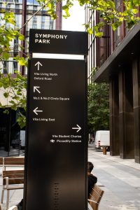
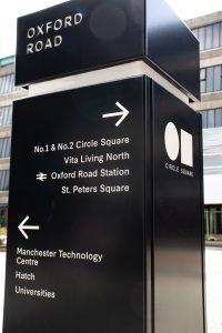
Wayfinding signs are integral to the user experiences of a space. Whether in a bustling city, a serene park, or a hectic hospital, these signs ensure that people can find their way safely efficiently, and with confidence. Good wayfinding design takes into account human behaviour, accessibility needs, and the aesthetic context, creating a navigable environment that is welcoming to all.
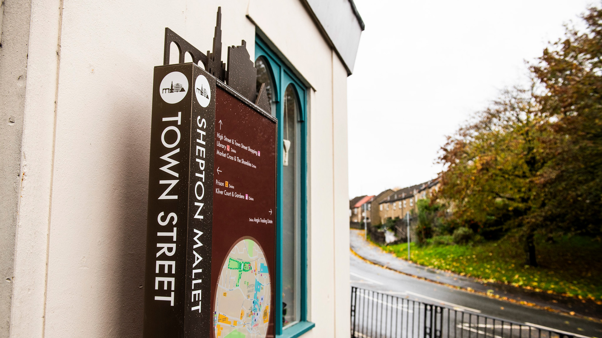
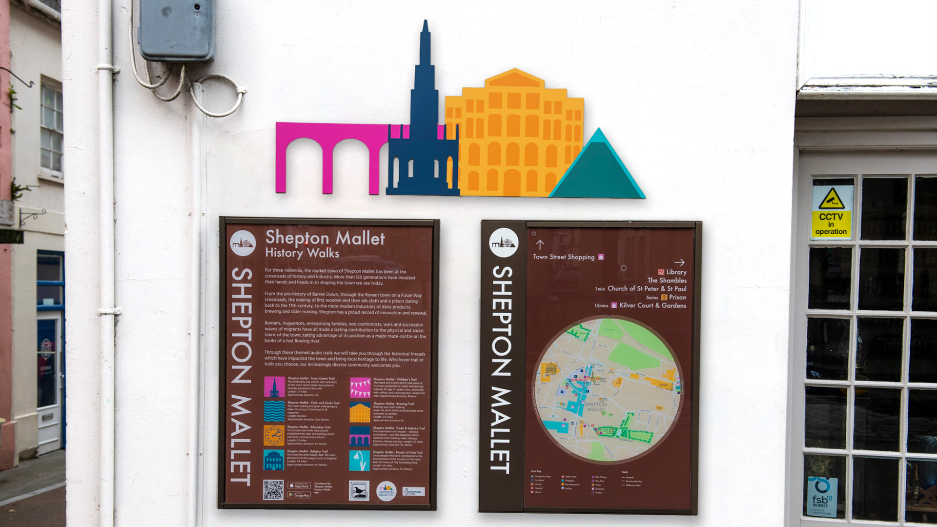
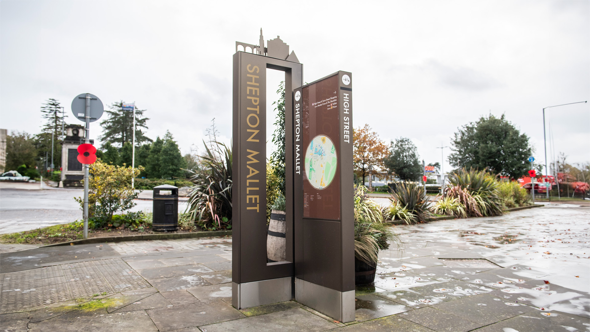
We’ve had the pleasure of working on some amazing wayfinding projects, including our award winning schemes at Wellington Place, Leeds Shepton Mallet, and projects like Circle Square, The Royal Exchange and The Great Northern Warehouse in Manchester. These projects have been incredibly successful, and we’re proud of how they’ve helped people navigate and enjoy these spaces.
Wayfinding isn’t just about putting up signs; it’s about creating clear, intuitive paths that make it easy for people to find their way and feel comfortable in their surroundings. We’re excited to keep pushing the boundaries in this area and look forward to taking on even more projects in the future.
